
My review of the new AOL Mail
Leave a comment AOL has decided to force Yahoo Mail upon us with a different logo. While I’m not especially pleased that the AOL Mail I have been using for years is now completely different, here’s my review and thoughts on the interface and features as well as what I miss from the old:
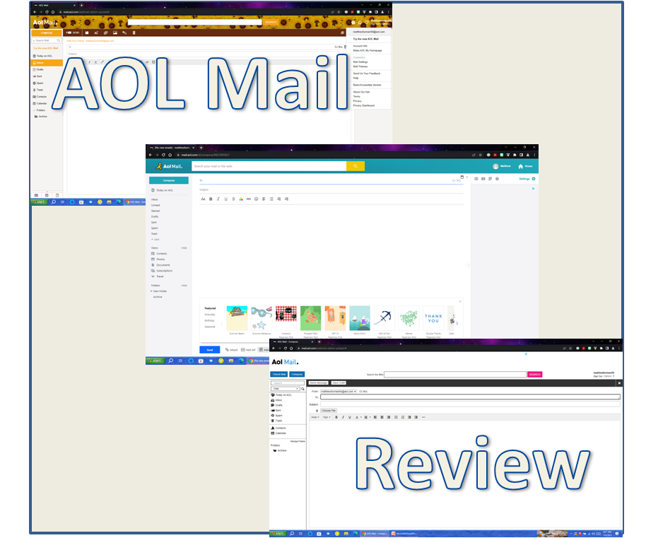
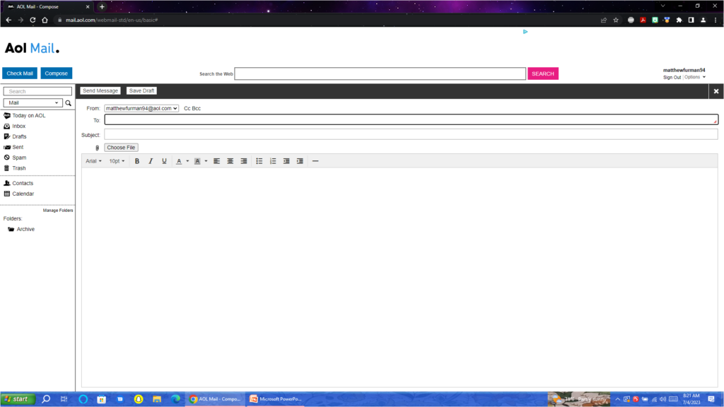
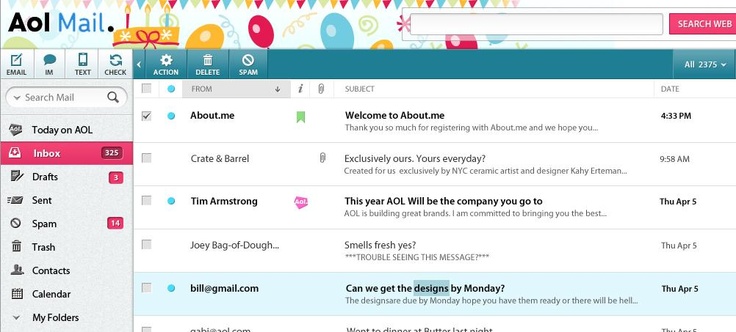
Here are pictures of the New AOL Mail, Classic AOL Mail, and Basic AOL Mail:
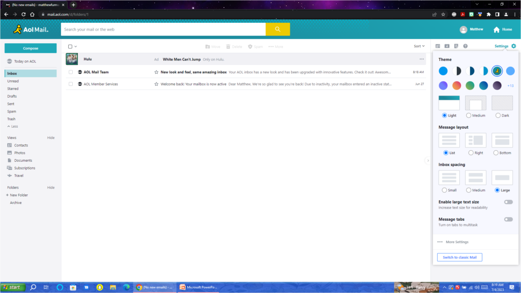
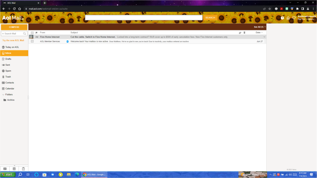
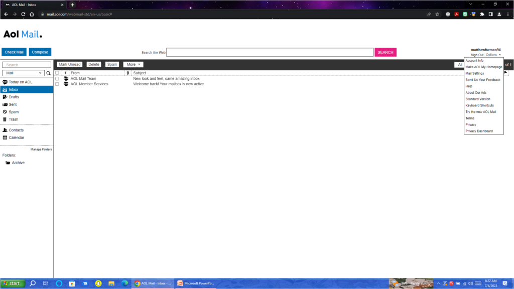
The Inbox:
In the new Inbox, there are a few new features such as folder views for pictures, documents, and travel. This is a nice addition. I’m not a fan of the subscriptions view which lets you unsubscribe from newsletters because it sometimes shows senders who have only sent me mail once with no way to delete from the page, and sometimes spam emails show up. Clicking the unsubscribe button sends an email which when the sender is spam only confirms a valid email address. A neat idea, but needs improvement.
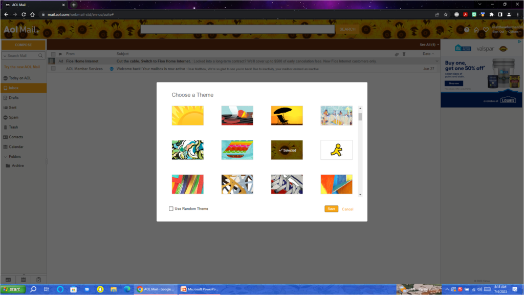
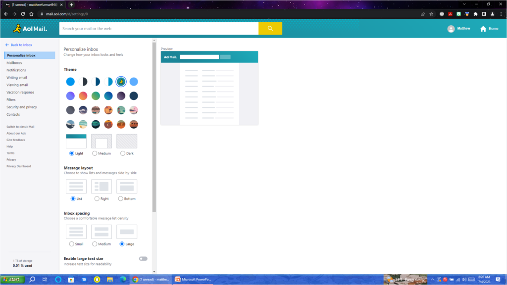
The themes in the new AOL Mail is not nearly as creative as what we had before in Classic AOL. Classic AOL had many fun mailbox themes including holidays. The new AOL Mail has a few basic ones, the AIM Running Man, and a few basic seasonal themes, but that’s it. It feels very plain and basic compared to what was available before. I will miss my sunflowers I’ve had since 2009.
On smaller screens the new AOL Mail uses up more screen real estate than I would prefer. It is not too different on a larger screen like shown below. Plus, it has a dark mode with the themes which is nice when using the computer later in the day.
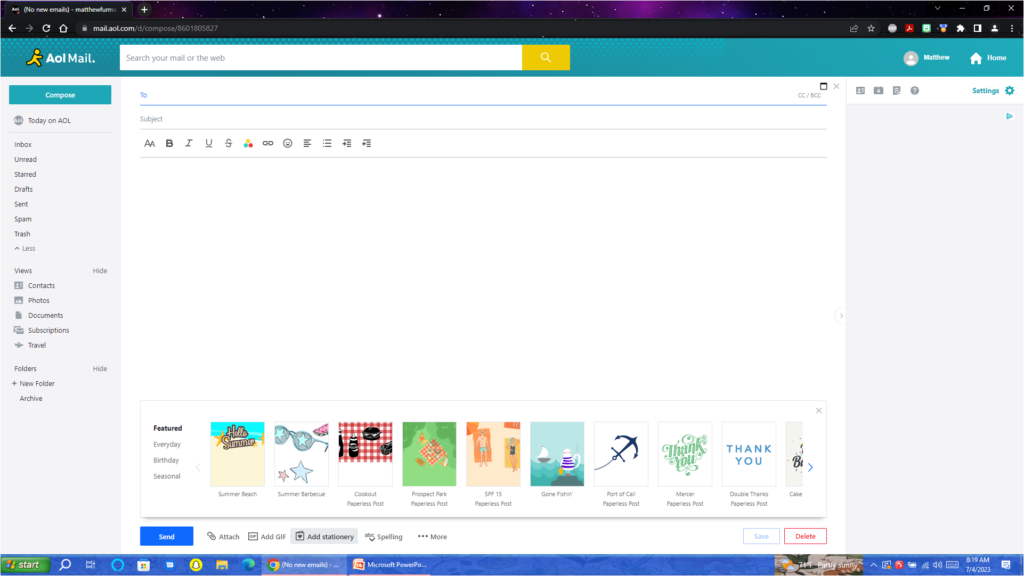
Compose New Message:
This is where some major differences become apparent. All the buttons are moved to the bottom of the screen and the option to insert pictures into the message is gone.
Webmail stationary is available with a lot of choices, although the cute whimsical options are mostly gone and holiday and seasonal stationary is only available during the intended season. Unlike the Classic AOL which had all stationary available all year round.
A lot of the font options are now gone. No more comic sans in email messages.
Emoji’s now replace the classic emoticons. While there is more options, some cute smileys are gone. They were so simple.
The option to add a GIF into a message is also new.
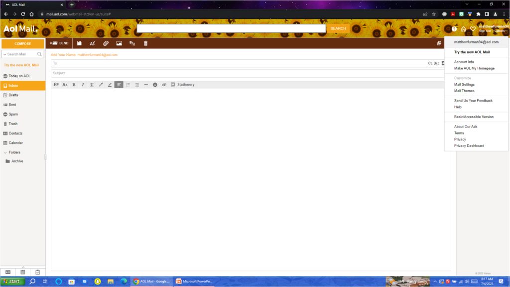
Settings:
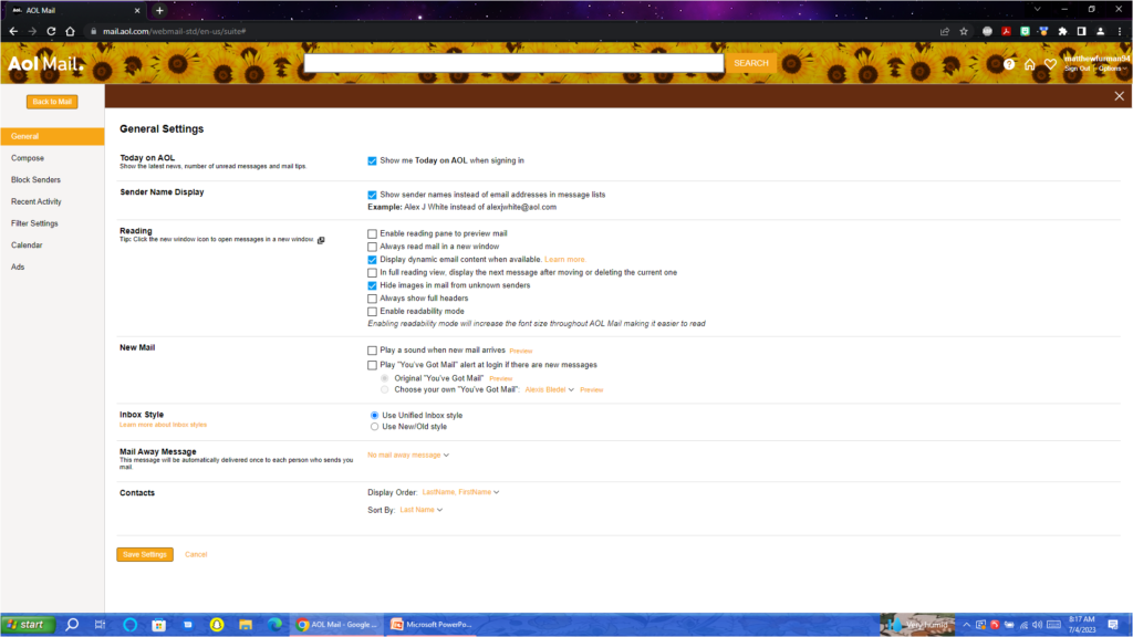
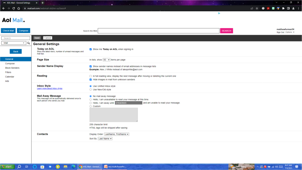
There are several new settings options. The classic You’ve Got Mail is still an option and you can still choose celebrity voices. This is also where you can choose the Light, Medium, and Dark options for the webmail theme. The settings isn’t too difficult to navigate. However I hope AOL adds some of the Yahoo Mail features. Yahoo owns AOL and this new interface is exactly the same but with a different logo. Aside from less features, the only major difference between what Yahoo Mail offers and this is the larger font size and AOL has a few more themes. The themes and You’ve Got Mail were the only 2 suggestions they actually listened to when I left feedback on UserVoice.
Conclusion:
While the addition of a few new features is nice, this change feels largely unnecessary in terms of user benefits. Most of AOL’s users have had the service a long time and familiarity has been one major benefit. It feels like Yahoo wants to simplify their costs by maintaining one interface instead of two. While this would make sense from a business perspective, it limits consumer choice. I stopped using Yahoo Mail as my primary email in 2009 because I preferred AOL. Now this choice has been taken away.
While I will get used to this new interface, It’s not completely new to me. I have been using it on my Yahoo Account since it was introduced in 2017, I will miss decorating my inbox for Halloween and Christmas. Thankfully I saved the AOL Mail Stationary by forwarding a blank message using each one to myself so I still have that to hang onto. For now I have picked the AIM Running Man theme for my inbox as it is as close to the nostalgic AOL and I can get on this new interface.
I wish AOL would give the option to switch back and forth between New and Classic as they did before. Since they seem to be okay with ignoring 13,000+ negative comments on UserVoice suggesting this, It would be nice if they would at least give us the extra features that come with Yahoo Mail. I don’t completely dislike the new mail, but preferred the old one. It was fun, whimsical, simple, and familiar.
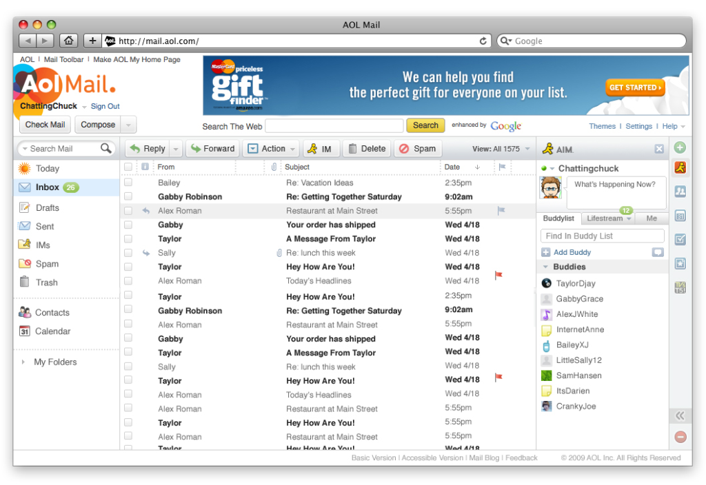
Just for fun, here’s what AOL Mail looked like in 2009, and then in 2012 when the Classic AOL Mail was new (there have been some UI changes over the years). I do miss having AOL Instant Messenger integrated. it was fun chatting with SmarterChild when I was supposed to be working in class.
I unfortunately didn’t take screenshots in 2009 or 2012, so these are from Google.
2009 AOL:
2012 AOL:
If anyone really wants to compare the screenshots from every screen within AOL Mail, here’s a zip folder of pictures.